Medium to Substack and the Weird-Button in Midjourney
Why I switched from Medium to Substack and how I managed to finally not only produce glossy and perfect images in Midjourney
Dear friends,
Today I switched from the blogging platform Medium to Substack.
Thanks for reading Marius’s Substack! Subscribe for free to receive new posts and support my work.
I heard that Substack is better to build a community and publishing podcasts.
Also they don’t hide the emails of your subscribers, so it is possible to use Substack as a newsletter tool as well. And once you turn on the payment option, you get money for each subscriber.
In total Substack feels a bit more geeky, but also offers some more precise features. Let’s see where this goes.
Yesterday I spent some more hours on creating images for the Spells publication with Midjourney.
I had trouble of getting a more rough and glitchy aesthetic because Midjourney always produces photos which look glossy and great. Almost impossible to add strong grain or a 16mm film feeling.
Just at the end of my session I saw in the Midjourney documentation that it is possible to add the prompt: —weird 400
That takes away some of the perfect quality which normally gets produced and additionally pushes the image into a pretty weird and more edgy direction.
Here I created images the normal way:
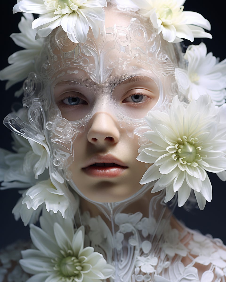
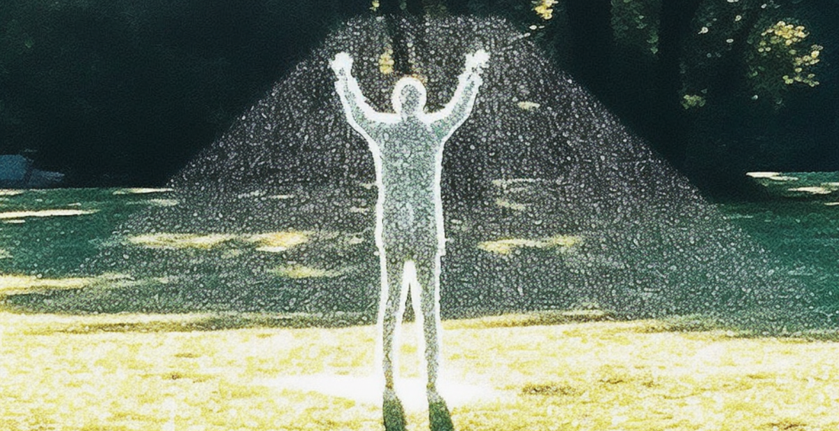
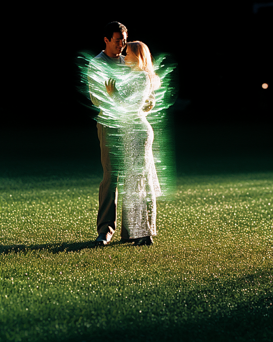
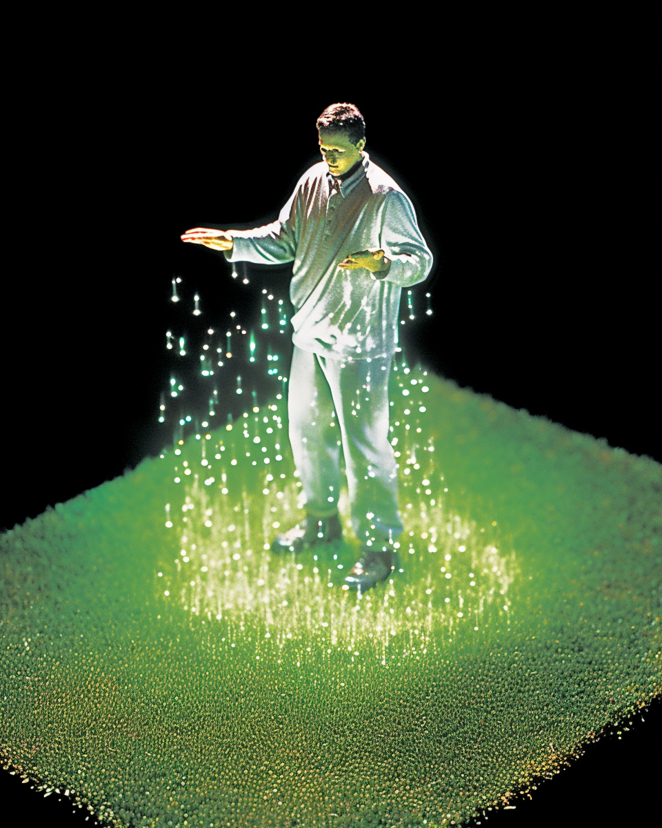
Same promt with extra: —weird 400
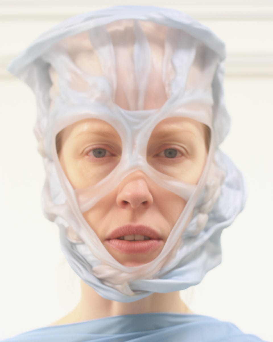
I like that the results move away from the fashion beauty standards and become a bit more edgy and interesting.
Also it is possible to change the strength weirdness. You can use 100, 200, or maybe even 1000.
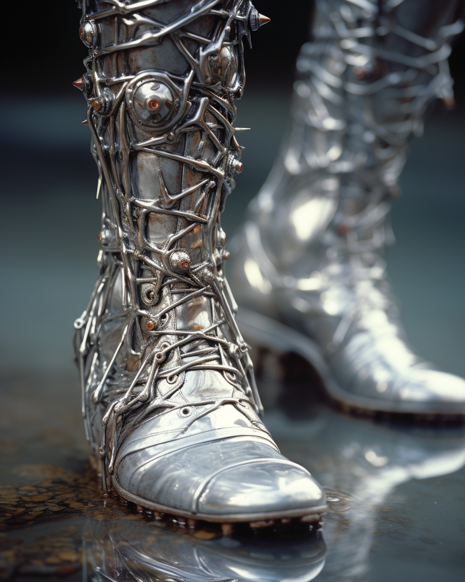
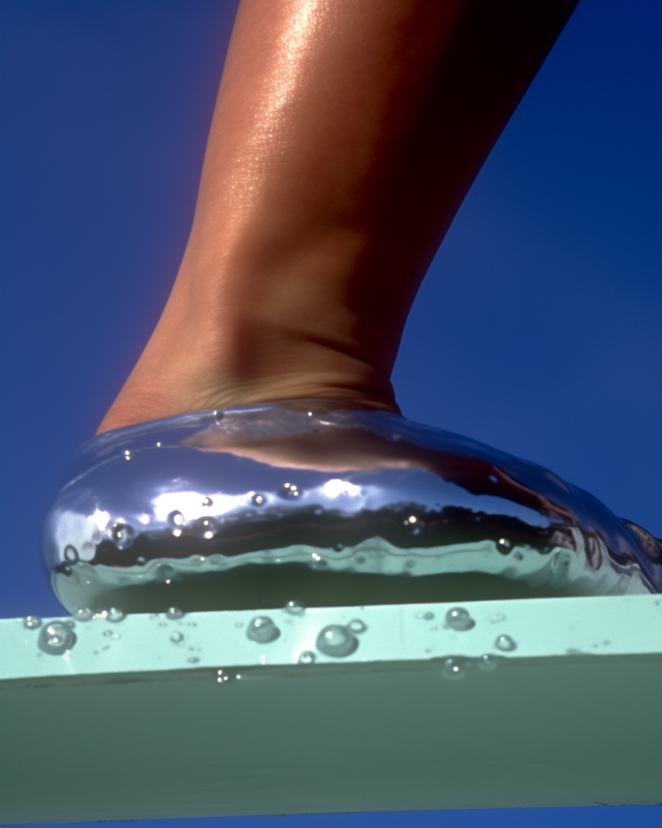
Here some some more examples. First image normal, the following images weird.
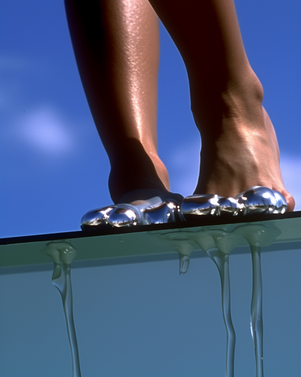
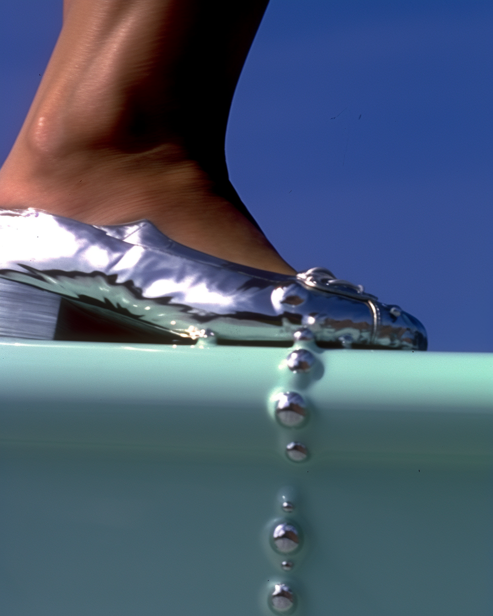
And one more:
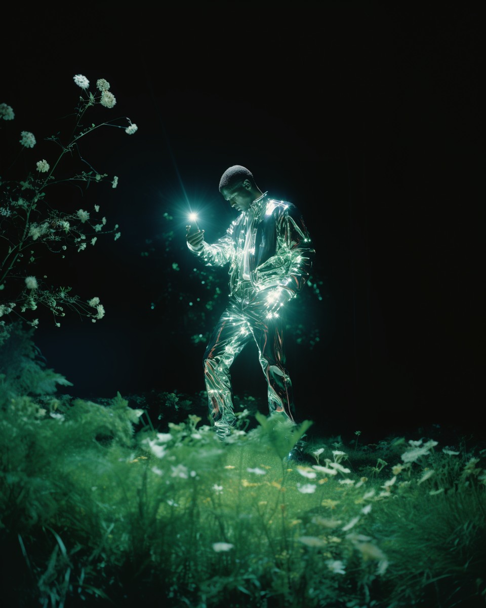
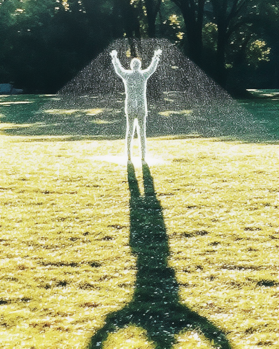
I am feeling very happy that I found the weird button. Otherwise Midjourney would have stayed a bit boring.
I don’t like images which are too perfect and all glossy. For me things become interesting when they are aesthetic but also on the edge to ugly.
Much love,
Marius
Thanks for reading Marius’s Substack! Subscribe for free to receive new posts and support my work.

